New York's southern rivals get a lot of attention this week.
The first half of the MLB season winded down last week, but that didn't mean that the league's teams stopped showing off some interesting uniform combinations. Things got especially interesting in the midwest, where the Brewers once again made us long for the days of royal blue and glove-shaped logos, while the Cubs held another fun throwback day at Wrigley Field.
Braves vs. Mets
Photo credit: Robert Deutsch-USA TODAY Sports
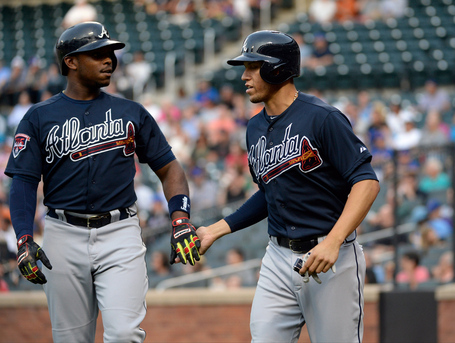
The Braves wore these "alternate" road jerseys in all four of their games in Queens last week. I can't really blame them, since I've enjoyed the navy duds every since Atlanta debuted them a few years ago. They go really well with the Braves' all-blue road caps, and the bright coloring on the tomahawk contrasts strongly with the rest of the jersey to make it stand out.
This look is so strong for the Braves, that I now think the team looks awkward when it wears its gray road uniforms. The red "Atlanta" text on that jersey doesn't go all that well with the blue hat. The powers that be should really consider using the red-brimmed home hat with the road grays as well. Just save the blue hat for the blue jerseys.
Cardinals vs. Brewers
Photo credit: Mike McGinnis
Perhaps the only bad thing about these jerseys is that they are spring training jerseys. You can tell by the piping on the sides and and stripes on the collar. Without all of that, we might have something here. The Brewers have got to get more of the "mb" glove logo in our lives, so why not feature a jersey with it on the chest? Well, for one thing, the rest of this shirt is too blank for a colored jersey. I could see the chest logo working with a pinstriped shirt, but that might look like the Brewers are ripping off the Yankees. It's worth looking into, though.
Either way, the bordered font on the back is a keeper.
Braves vs. Cubs
Photo credit: David Banks-USA TODAY Sports
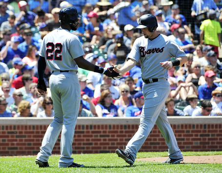
Yes, there is a lot of Braves coverage in this week's column, but say what you will about the team, it usually dresses well. This weekend in Chicago was no exception, where Atlanta showed off its 1969 uniforms to honor the 100th anniversary of Wrigley Field. Like a lot of the throwbacks we've seen at Wrigley this year, these Braves jerseys are rather bland, but it's cool to see the "home" script on the road jersey.
It didn't hurt that these uniforms perfectly match what the team is currently doing with its headgear. In fact, the blue jersey font matches Atlanta's blue hat a lot better than the red font on their current gray jerseys does.
Photo credit: Jonathan Daniel
It was surprising to see the "screaming Indian" logo on Atlanta's throwbacks because the symbol has been controversial for a while now. In fact, the team was supposed to wear it on batting practice hats last year, but it ended up switching to a more politically correct lowercase "a" that Atlanta wore in the 1970s. Is the logo okay now because it's featured on a throwback jersey and is used to create authenticity? If you're going to scrap something, you should probably scrap it for good.
Photo credit: David Banks-USA TODAY Sports
Of course, the Cubs wore their own 1969 uniforms on Sunday, and as usual, they looked pretty good. These jerseys are a lot like what the Cubbies wear today. The blue pinstripes are there, as well as the logo on the chest. The only real differences are the lack of names on the back and a thinner blue circle around "Cubs" symbol. What I really like, though, are the MLB logo on one sleeve (almost as cool as the National League logo on Chicago's blue alternate road jerseys) and the old cub face logo on the other sleeve.
All-Star Game
Here is a picture of all the hats that will be worn during the All-Star Game tomorrow in Minnesota. Yes, front panels are in vogue, but what we haven't seen a lot of so far is front panels in a color other than white. Some of these hats are bland (Angels, Yankees, Tigers), but others are really adventurous with the colors. Just look at the Mets' hat! Never have we seen that much orange above the brim on a Mets hat. I also dig what the Royals and Rays did with the light blue and royal blue/red combo of Philly and Texas.
Tonight, players will be wearing special Home Run Derby caps that are basically just your team's regular hat in Twins colors. I'm not sure what the mainstream appeal of these is supposed to be. The "N" and "A" hats in years past were much more interesting.


