Clik here to view.

The Uniform Review hits the midwest to check out some classic outfits.
The Amazins visited a couple of great ballparks this past week in Wrigley Field and AT&T Park. Would the uniforms be just as classy as the hardball cathedrals? That depends on your sense of style, but no matter your taste, you'll probably want to see what the Cubbies wore on Sunday.
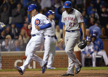
Mets vs. Cubs
Image may be NSFW.
Clik here to view.
Photo credit: Brian Kersey
The SNY guys weren't too hot on the Cubs' home uniforms, but I don't know what's not to like about them. They're like the classic Yankee pinstriped jerseys, but more fun with bright blue and red. Plus, the names on the backs and the fun sleeve logo give make this beauty a modern classic. The Cubbies only wear their blue alternates on the road, and it's not hard to see why.
The Mets were smart to match Chicago's home whites with "New York" road grays during the first two games of the series. There's no need to add more blue to the attire when these two clubs get together, and the old-school uniforms go great with Wrigley Field's charm, even under the lights.
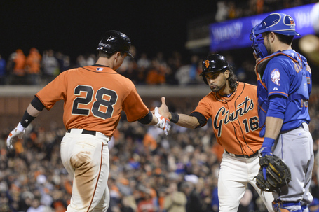
Mets. vs. Giants
Image may be NSFW.
Clik here to view.
Photo credit: Kyle Terada-USA TODAY Sports
I really like what the Giants did with their funky orange alternates this season. They switched the script from the modern block letters to the classic script "Giants" that the franchise brought over from New York back in 1958. The result is a great mix of old and new that is chicken soup for the uniform-lover's soul. Plus, the upward-slanting script gives the Giants a chance to wear numbers on their shirts, which is something that this team usually doesn't do.
Of course, if the Giants were going to wear bright orange, the Mets had to counter with the road blues. I wonder if this combination caused Mets management to further think about the possibility of orange alternates... We all know last year's "Los Mets" jerseys were orange in order to gauge a reaction from fans about the look. I'm fine with what the Mets have for now, but the team has been pretty aggressive with new uniforms in recent years.
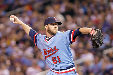
Twins vs. Brewers
Image may be NSFW.
Clik here to view.
Photo credit: Brad Rempel-USA TODAY Sports
The Brewers have been busting out their blue 80s pinstripes pretty regularly these days, but this week we got a surprise when the Twins joined the fun with baby blue road jerseys.
I'm not the biggest fan of Milwaukee's current ensemble, and I would have thought that by now they would have switched back to royal blue full-time, but it hasn't happened yet. The "M" underlined with wheat they they wear on their modern caps just doesn't compare to the old "MB" glove design that is beautiful in its simplicity. That said, the rest of the uniform is pretty generic, so maybe the Brewers can mix the old with the new to create something truly awesome.
Image may be NSFW.
Clik here to view.
Photo credit: Brad Rempel-USA TODAY Sports
The blue road jersey fad was just a bit before my time, and I always have trouble understanding it when I see it. For example, why blue? Why not any other light color that goes with a team's color scheme? The Twins have been wearing navy for years, but this jersey -- which Minnesota wore from 1973 to 1986 -- is sky blue, presumably because that's what everyone else was doing. I guess it's slightly better than the pinstriped grays that the Twins wore in the late 80s until 2009, but in my estimation, Minnesota has never had a great road jersey. Maybe the club should mess around some more with the "TC" that looks so good on its hats. Maybe try putting "Twin Cities" instead of "Minnesota" would work? I'm open for ideas, Twins fans.
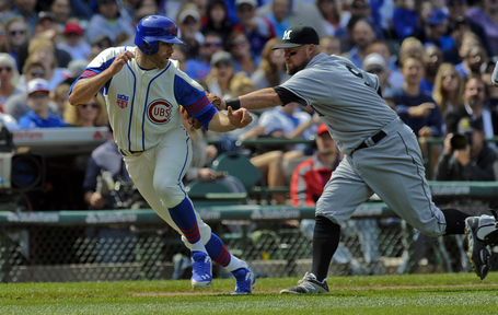
Marlins vs. Cubs
Image may be NSFW.
Clik here to view.
Photo credit: Matt Marton-USA TODAY Sports
As part of the Wrigley Field 100th anniversary celebration, the Cubs are wearing a bunch of throwback uniforms this season to celebrate each decade in which the franchise played in. On Sunday, the Cubs broke out a zippered vest design from 1942, and it looked fantastic. I didn't even know vests were worn by baseball players before the 1990s, but these uniforms look ahead of their time, especially with the sporty striped undershirts that match the players' socks. The "Health" patch worn opposite of the Cubs logo was something worn by all MLB teams in 1942 to promote physical well being, and I love how it matches the Cubs' colors and gives the vest a double-breasted feel.
As for the Marlins, they dressed as the Miami Sun Sox, a minor league team that played from 1940 to 1954. You have to give the Marlins credit for helping to add to to old-school atmosphere, but unfortunately their jerseys were dreadfully boring and they didn't have matching batting helmets like the Cubs did.
Uni-Watch has some more great pictures from Wrigley.
Independence Day Preview
Possible 4th of July MLB hats have been leaked on SportsLogos.net. The good news is that it doesn't look like teams will have to wear camouflage this year. The bad news is that these hats might be worse. Nothing is official yet (although real news regarding these hats should be coming soon), but it looks like it could be stars and stripes for everyone this Independence Day. You know what would really be independent? If a team wore a hat that looked good instead of the one the league told it to!